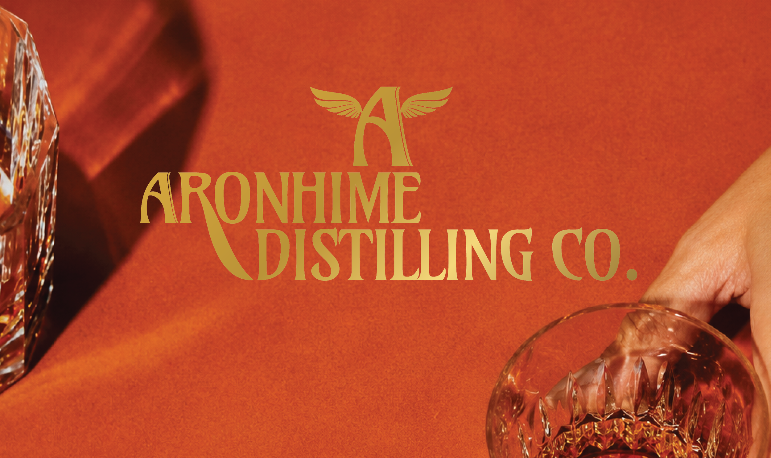
Aronhime Distilling Co.
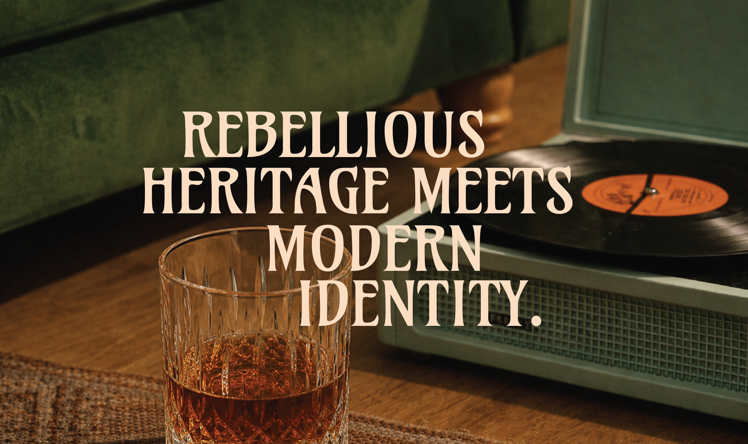
For Aronhime Distilling Co, we developed a full brand identity and label system that honored the family’s century-old whiskey legacy while reintroducing it through a bold contemporary lens. Drawing from themes of immigration, reinvention, and Americana, the work balanced archival influence with modern typography, layered storytelling, and striking visual contrasts to create a brand that feels both historically rooted and unmistakably current.
Brand Creation
Logo Suite
Brand Artwork
Label Design
Web Design + Build
(coming soon)
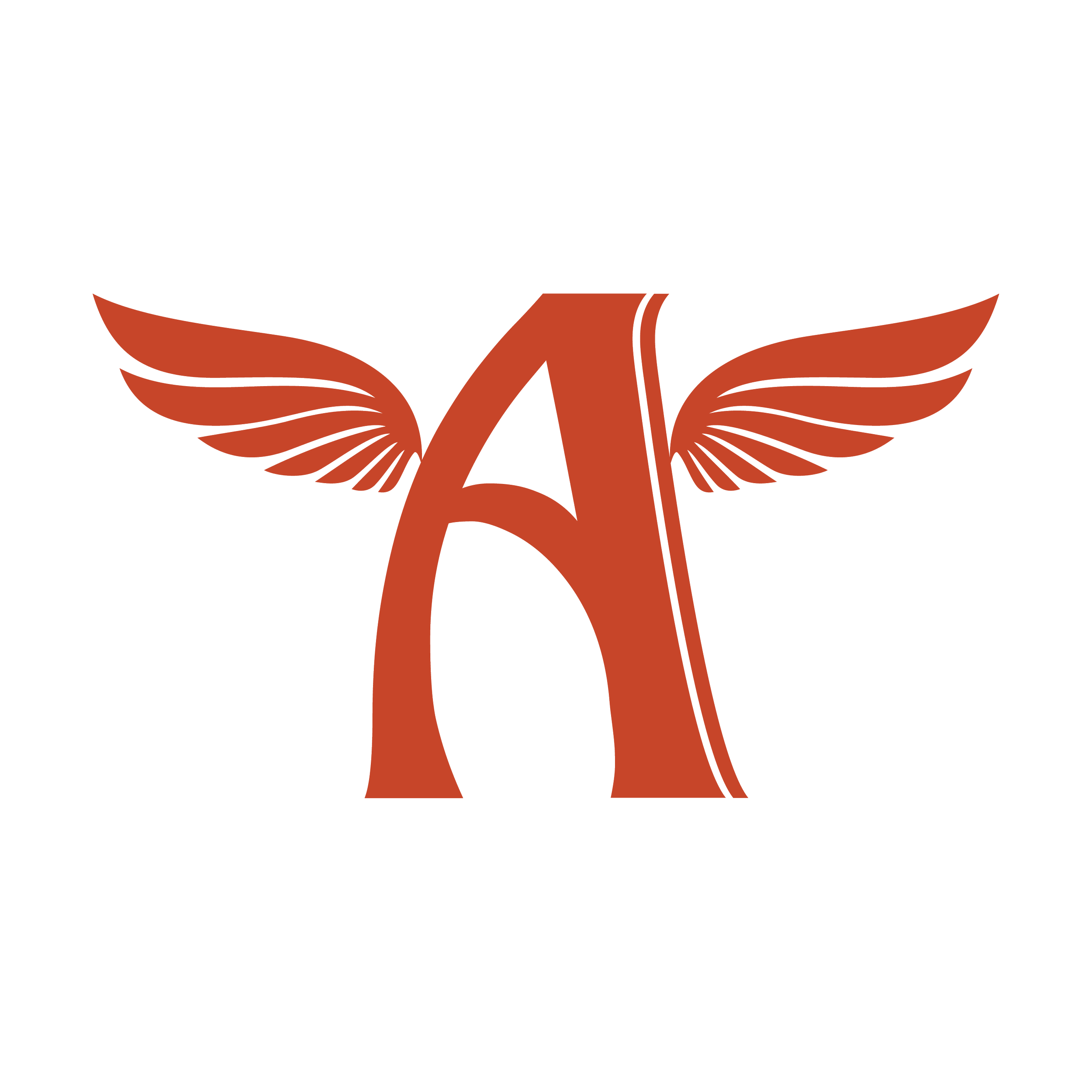
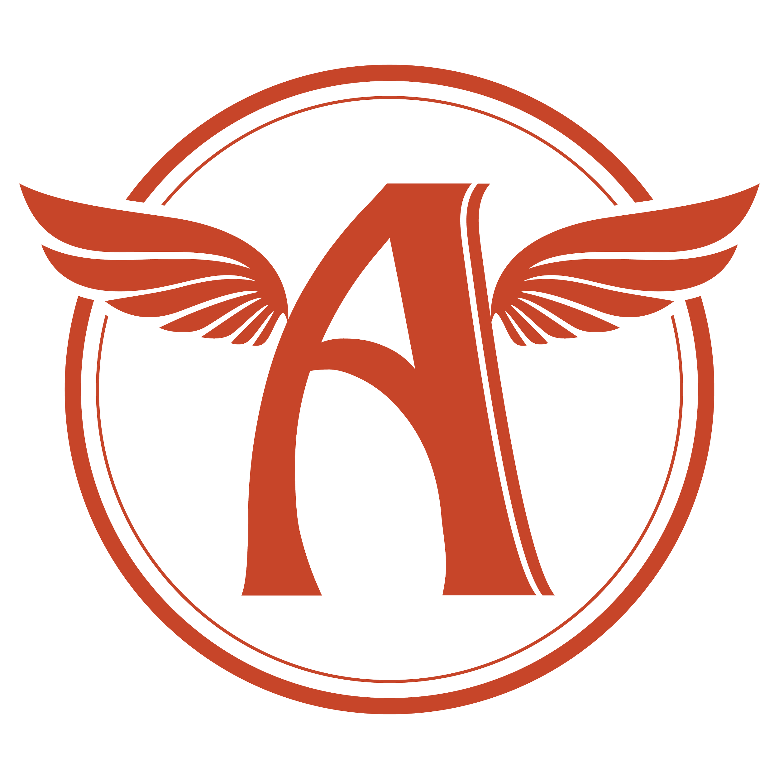
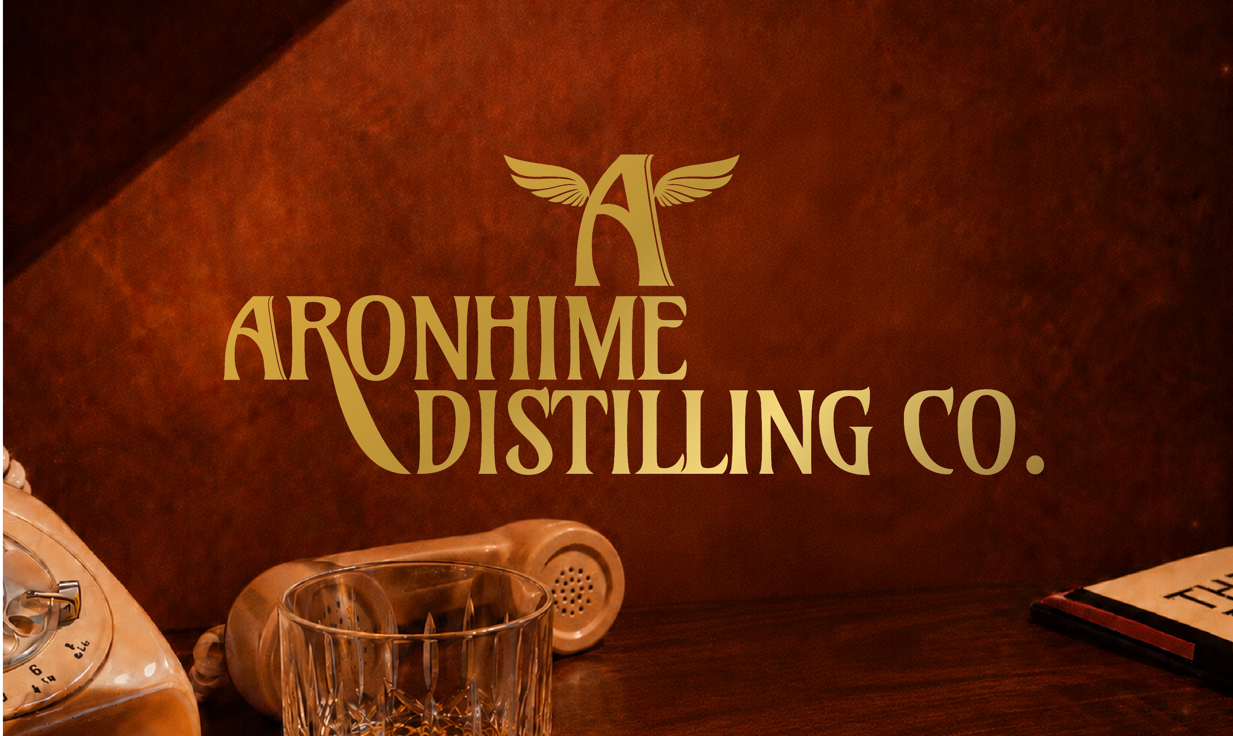
(01) PRIMARY LOGO
The identity balances heritage with boldness through custom letterforms and dramatic curves. Central to the system is the winged “A” — a revival of a symbol previously used by the Aronhime family.
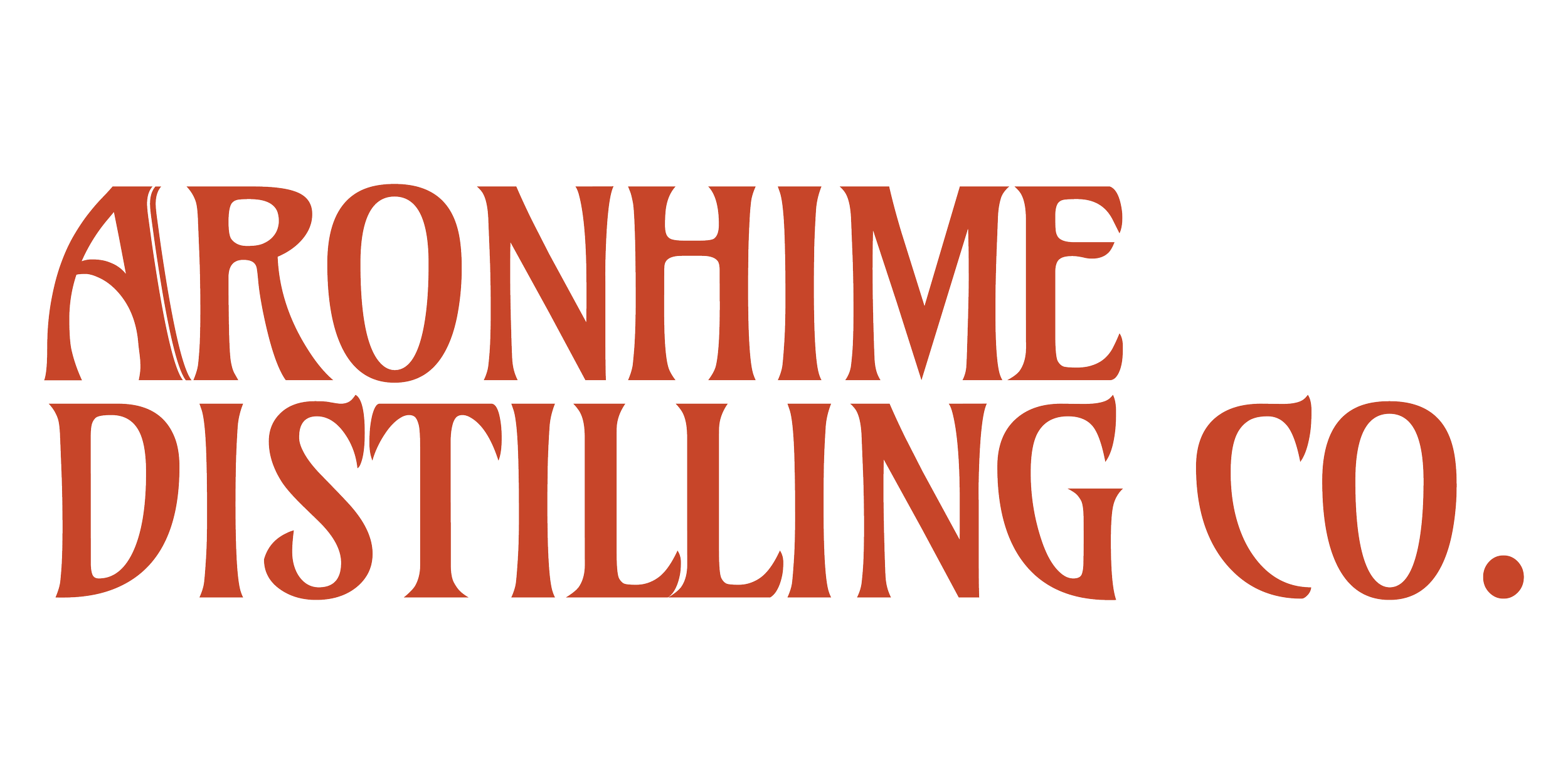
(02) PRIMARY WORDMARK
(03) PRIMARY LOGO MARK/MONOGRAM
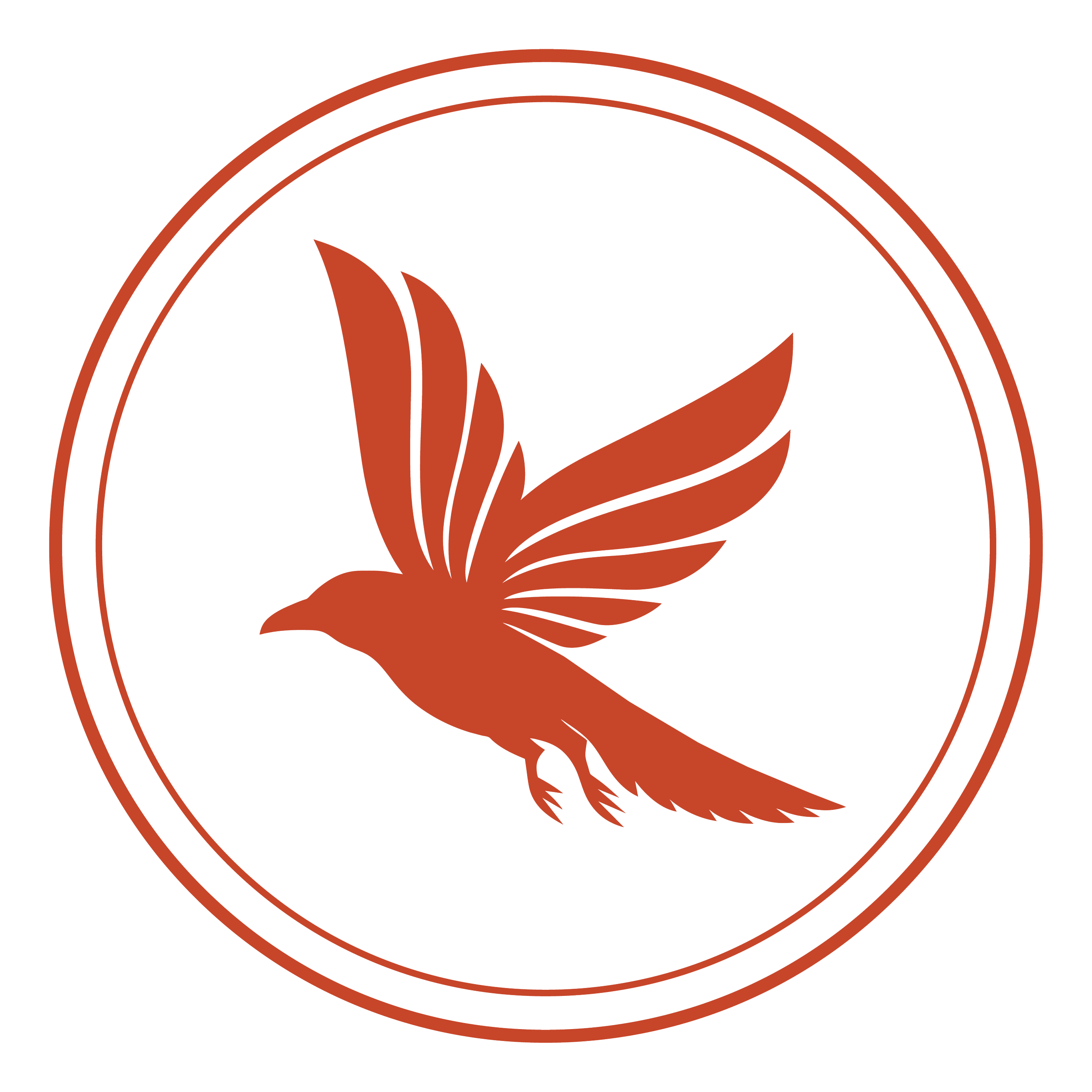
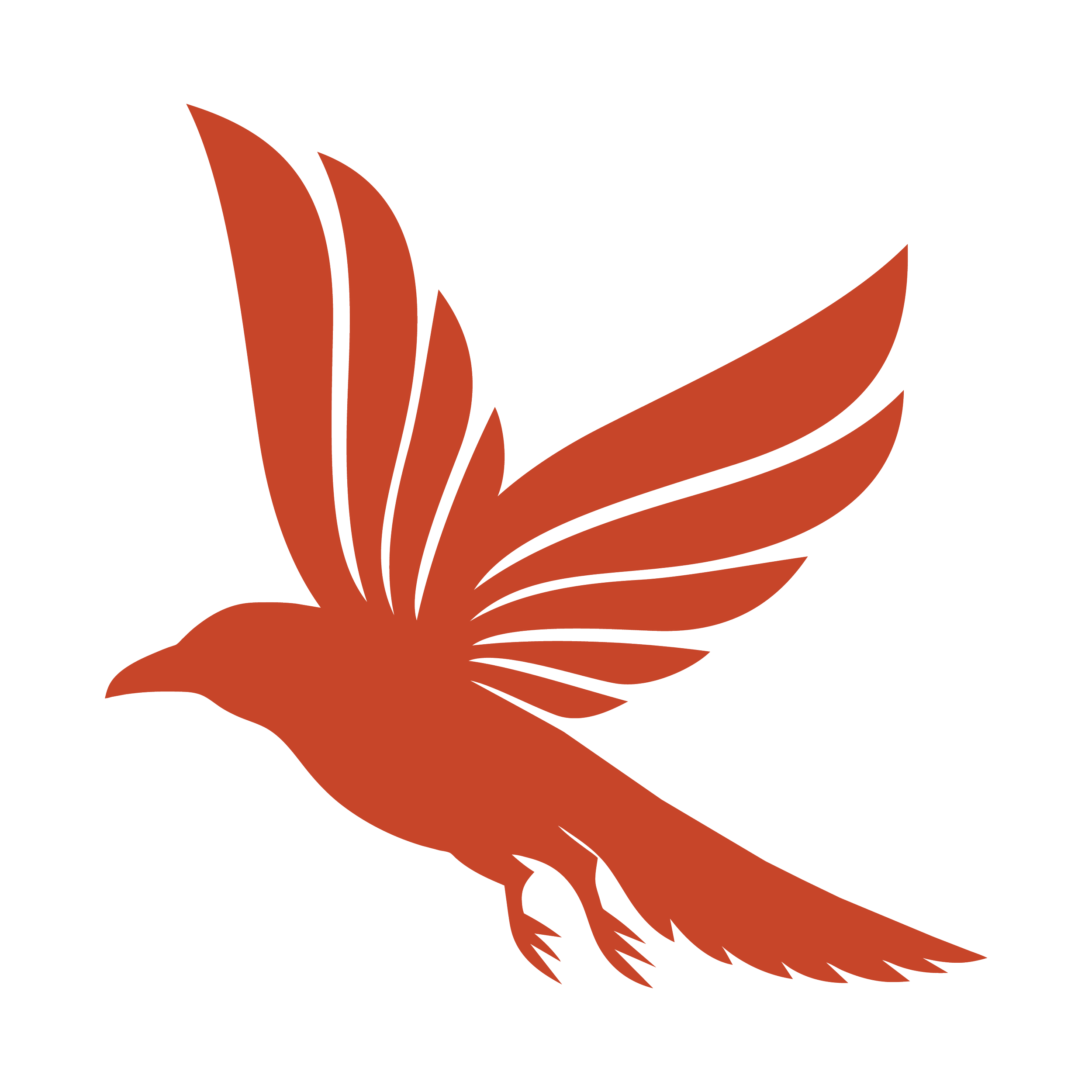
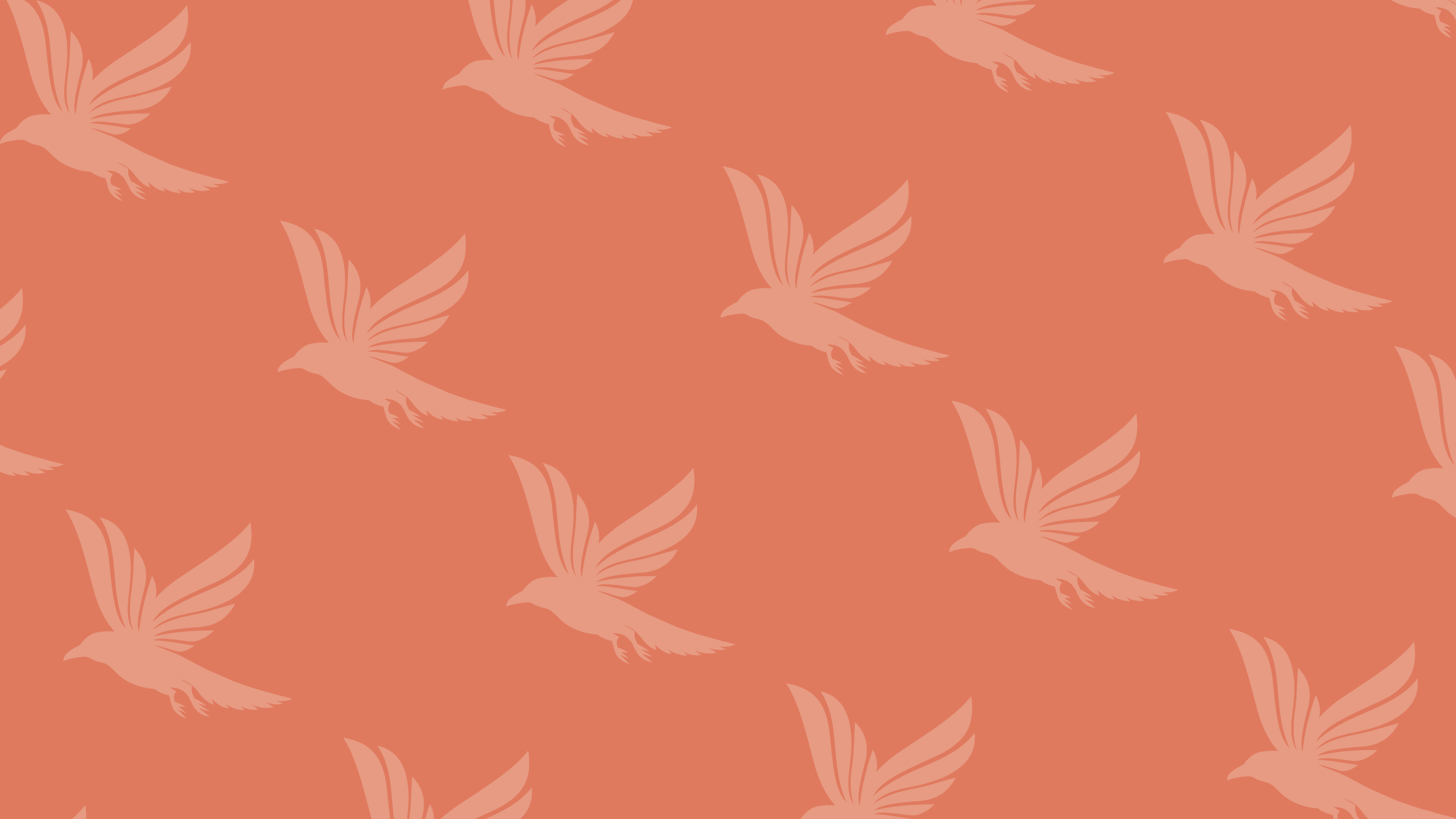
(04) SECONDARY LOGO MARK - THE RAVEN
Ravens have deep historical associations with craft, storytelling, intelligence, and ritual. They are keepers of secrets and knowledge.
The Aronhime Raven works beautifully as: bottle medallions, wax seals / stamps, barrel marks, social and merch iconography.
(05) TYPOGRAPHY
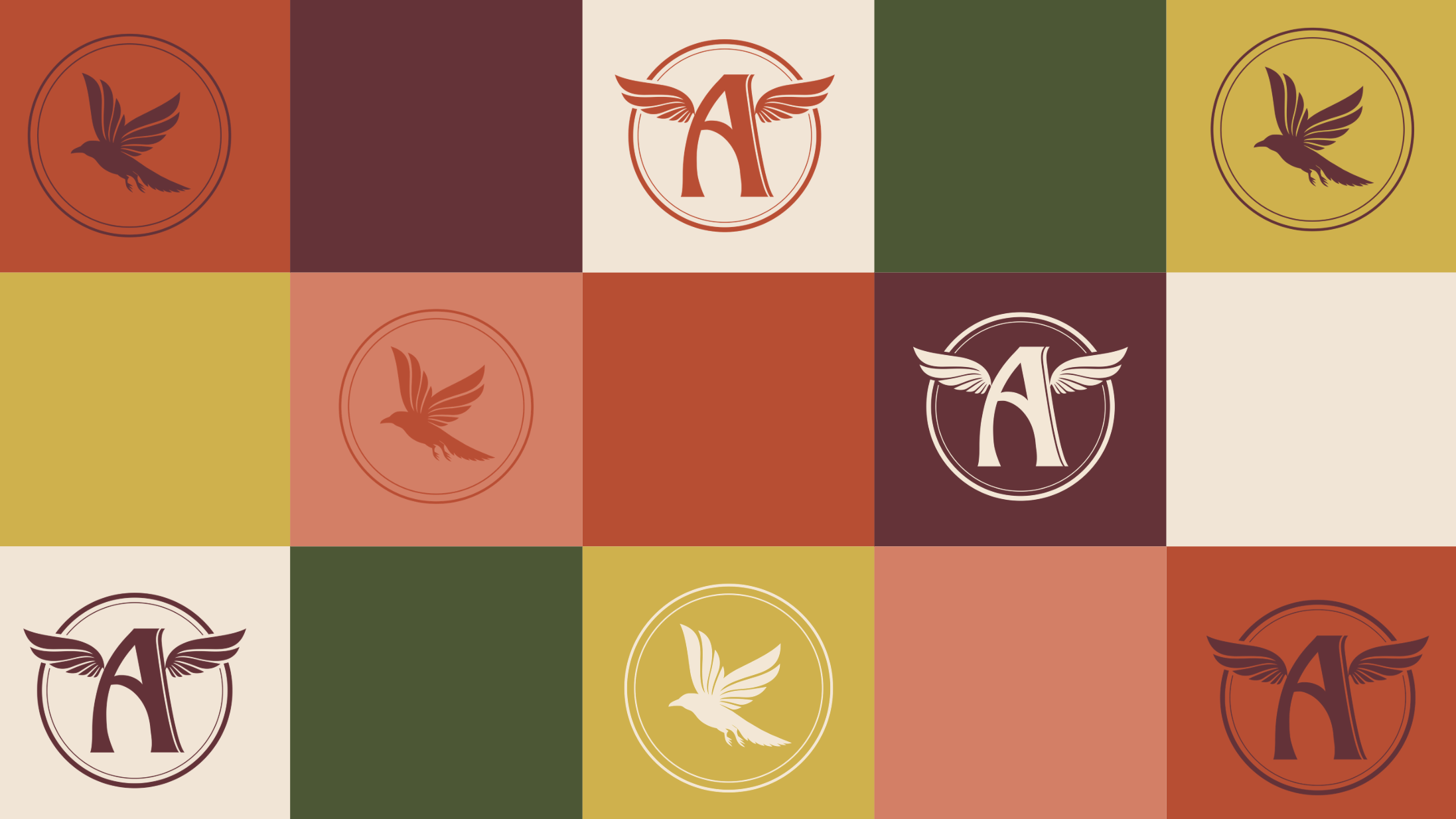
(06) COLOR PALETTE
(07) PATTERNS
The pattern system extends the identity into a more immersive visual world. Designed to add texture, rhythm, and recognisable brand presence.
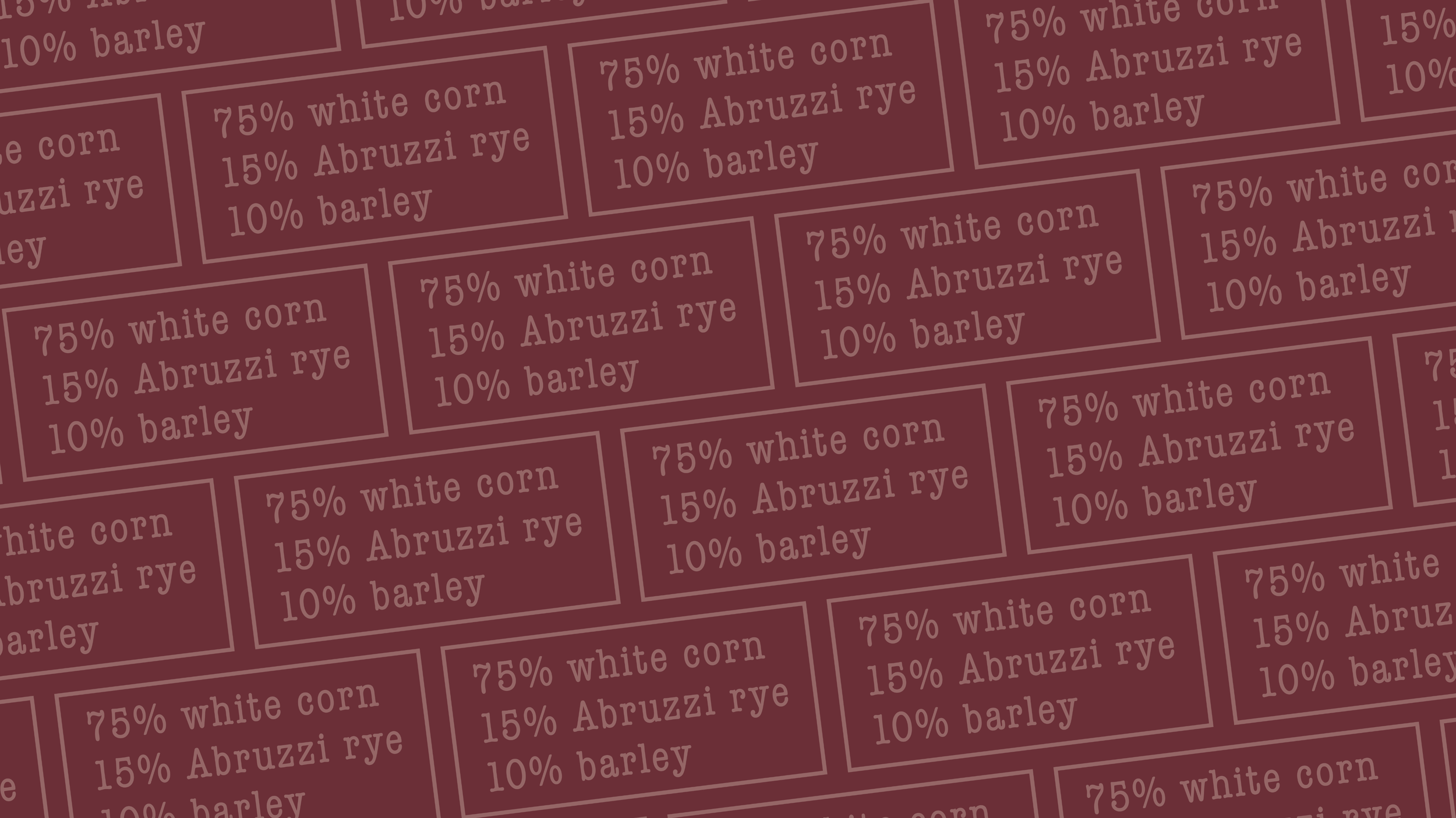
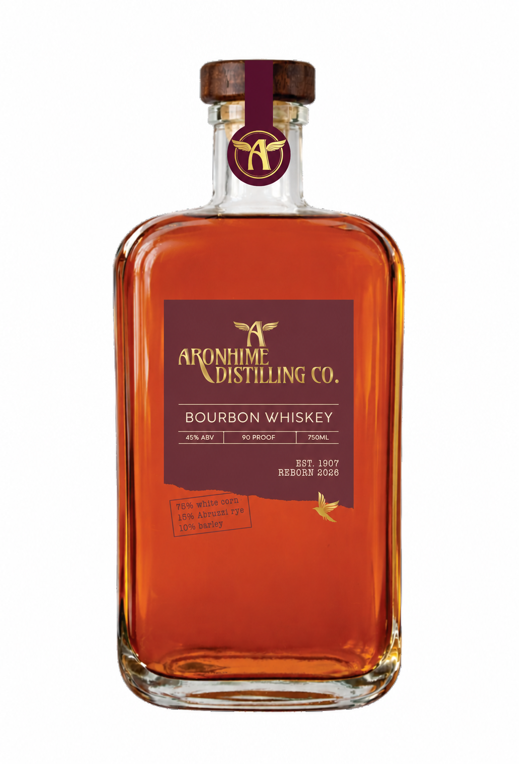
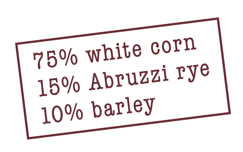
(08) THE MASH BILL STAMP
The mashbill stamp system introduces a tactile, utilitarian layer to the identity — drawing inspiration from archival distillery markings, shipping labels, and production documentation.
(09) LABEL DESIGN
More to come from this project — including website design, social rollout, packaging applications, and the next chapter of the Aronhime revival.